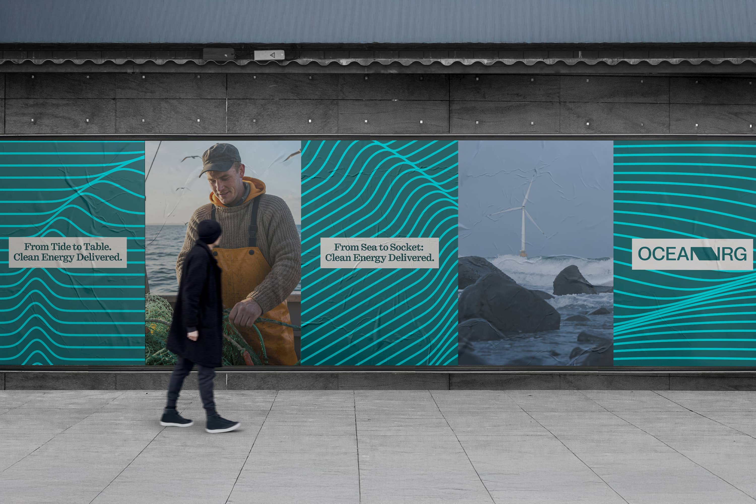
Branding a company like OceanNRG presents a unique and exciting challenge: capturing the immense power and potential of ocean energy while communicating a forward-thinking vision for sustainability. OceanNRG operates in a cutting-edge industry, transforming renewable marine energy into tangible solutions like green hydrogen and decarbonised marine fuels. The brand must reflect this pioneering spirit and establish a strong identity in a competitive green energy market. The challenge lies in striking a balance between technological innovation and accessibility.
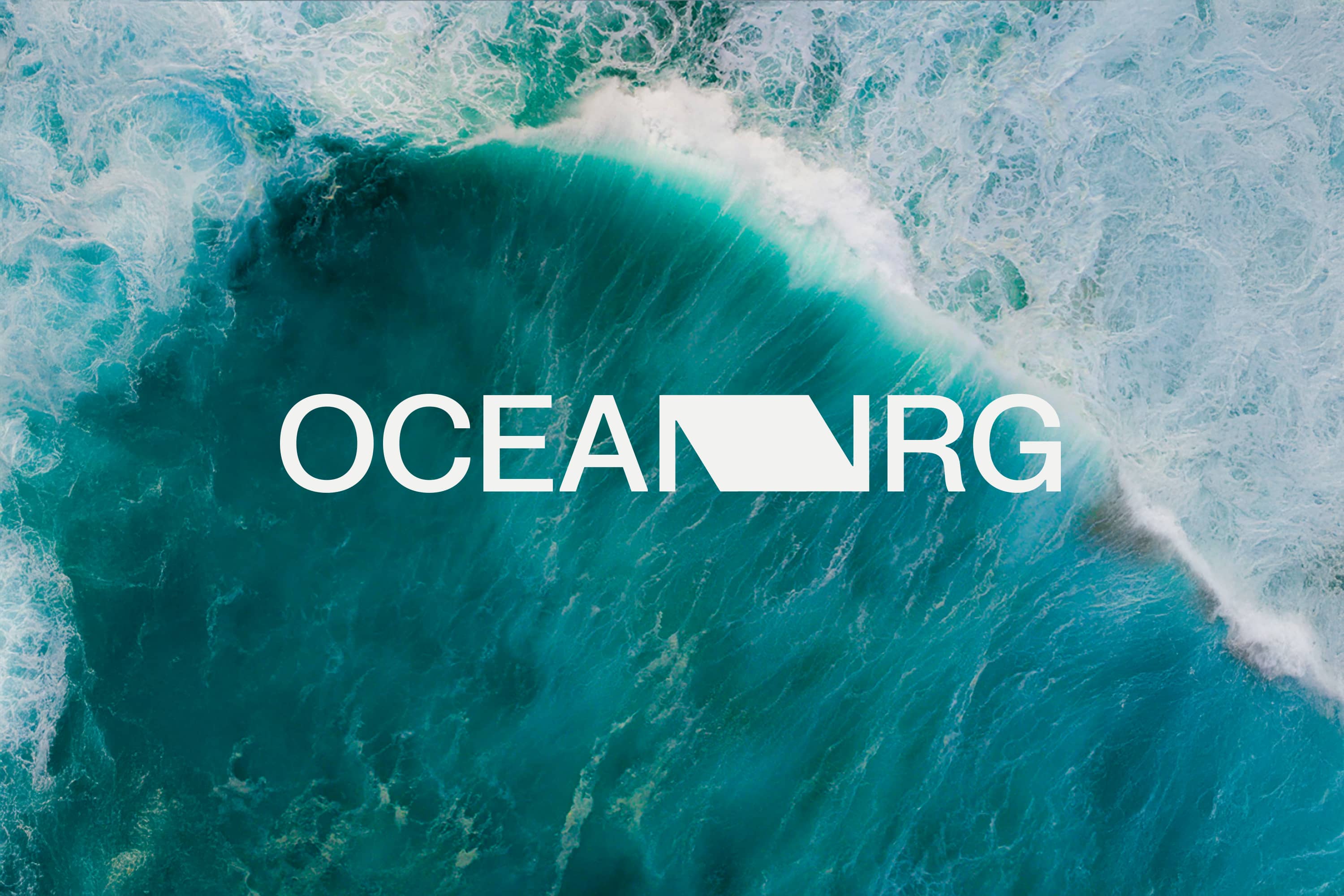
OceanNRG’s audience ranges from industry experts to the general public, so the brand must convey technical credibility while remaining approachable and inspiring. OceanNRG’s visual and verbal identity needs to evoke the ocean’s vastness and energy while staying modern and professional. Finally, The name itself posed a visual challenge, with two consecutive letter Ns appearing in separate words. Addressing this was essential to enhance accessibility and readability, ensuring the brand name remains clear and impactful across all applications.
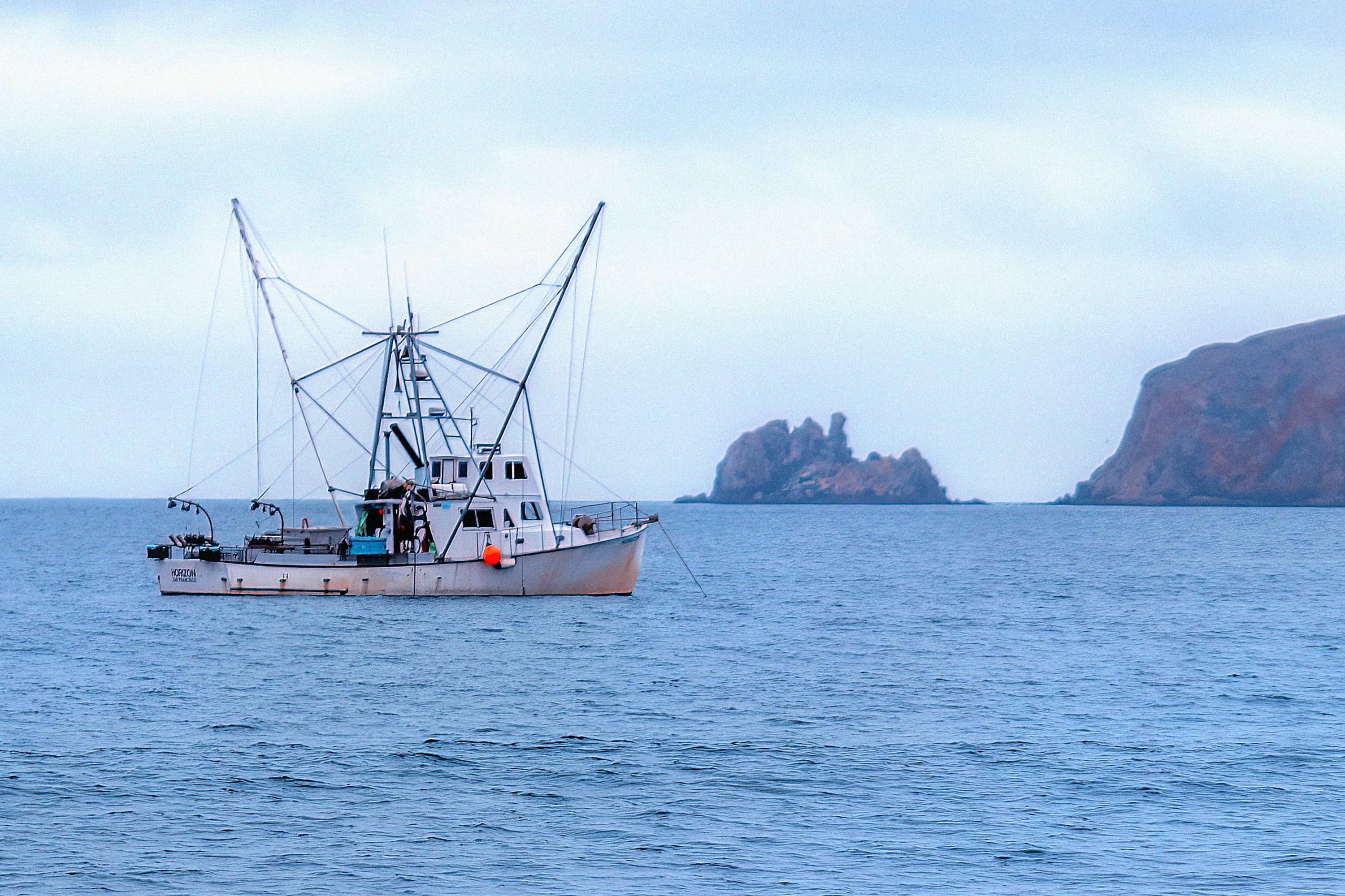
The maritime sector is at a pivotal moment, facing growing pressure to reduce its carbon footprint and adopt sustainable practices. As a new company in renewable energy innovation, OceanNRG is positioned at the forefront of this transition, offering groundbreaking solutions for decarbonising marine fuels. OceanNRG’s approach not only addresses the immediate need for sustainable fuels but also integrates with a broader vision of a green energy future. By harnessing offshore renewable energy to produce green hydrogen, the company is creating a sustainable ecosystem that supports both marine transportation and global energy demands. Through innovation and commitment, OceanNRG is setting a new standard for the role of marine fuels in a decarbonised world.
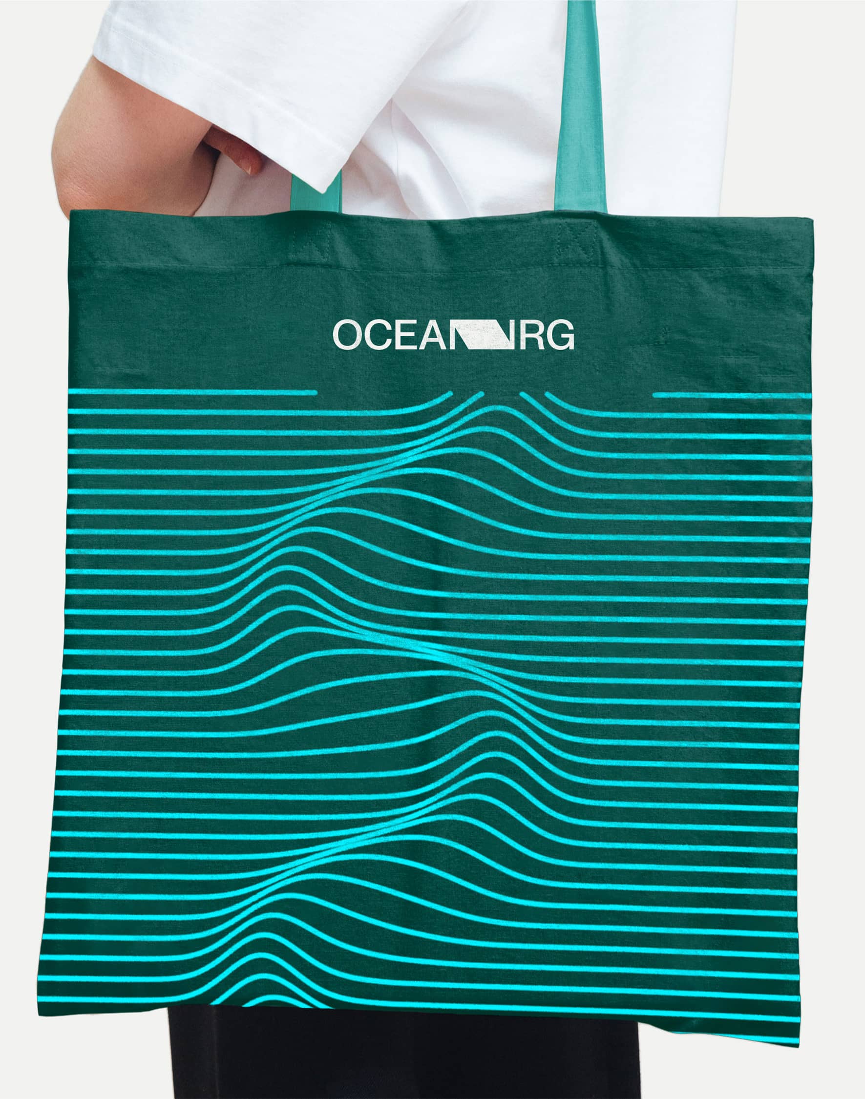
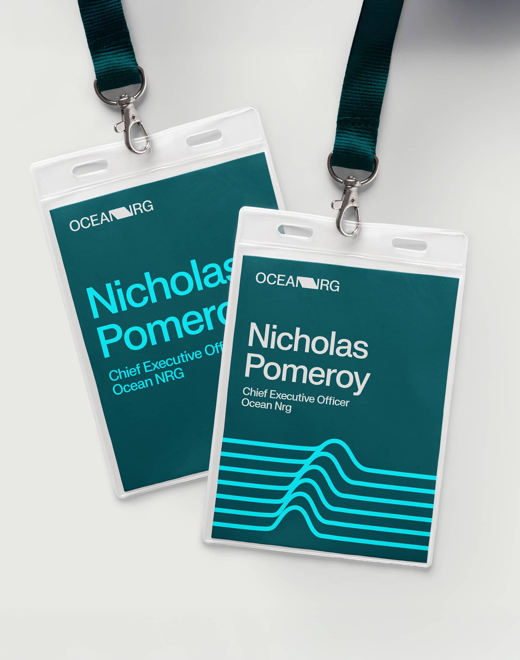
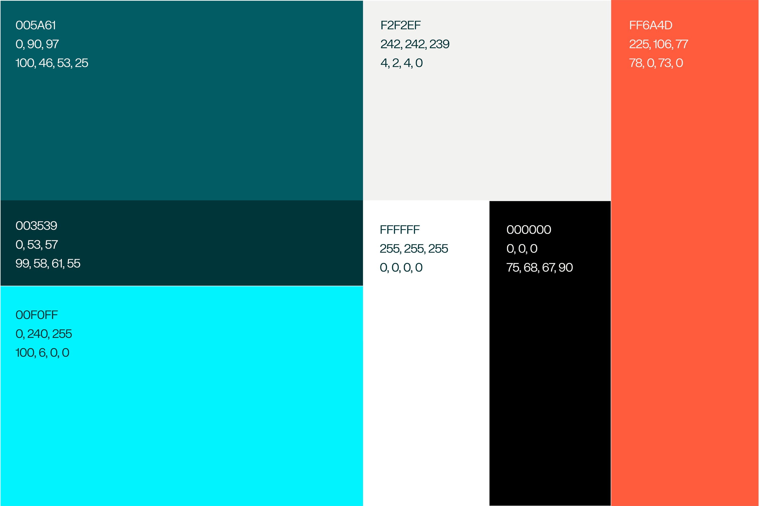
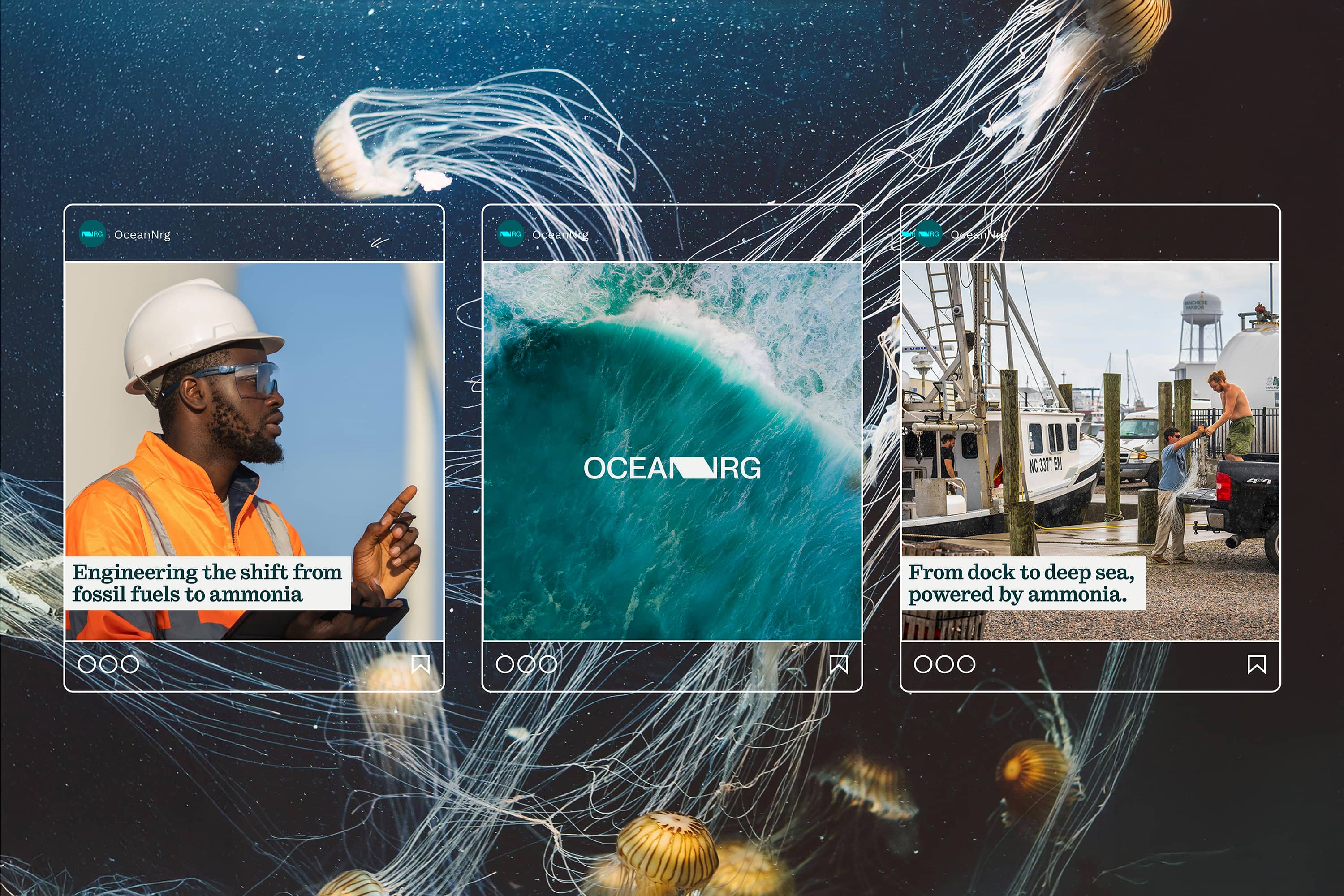
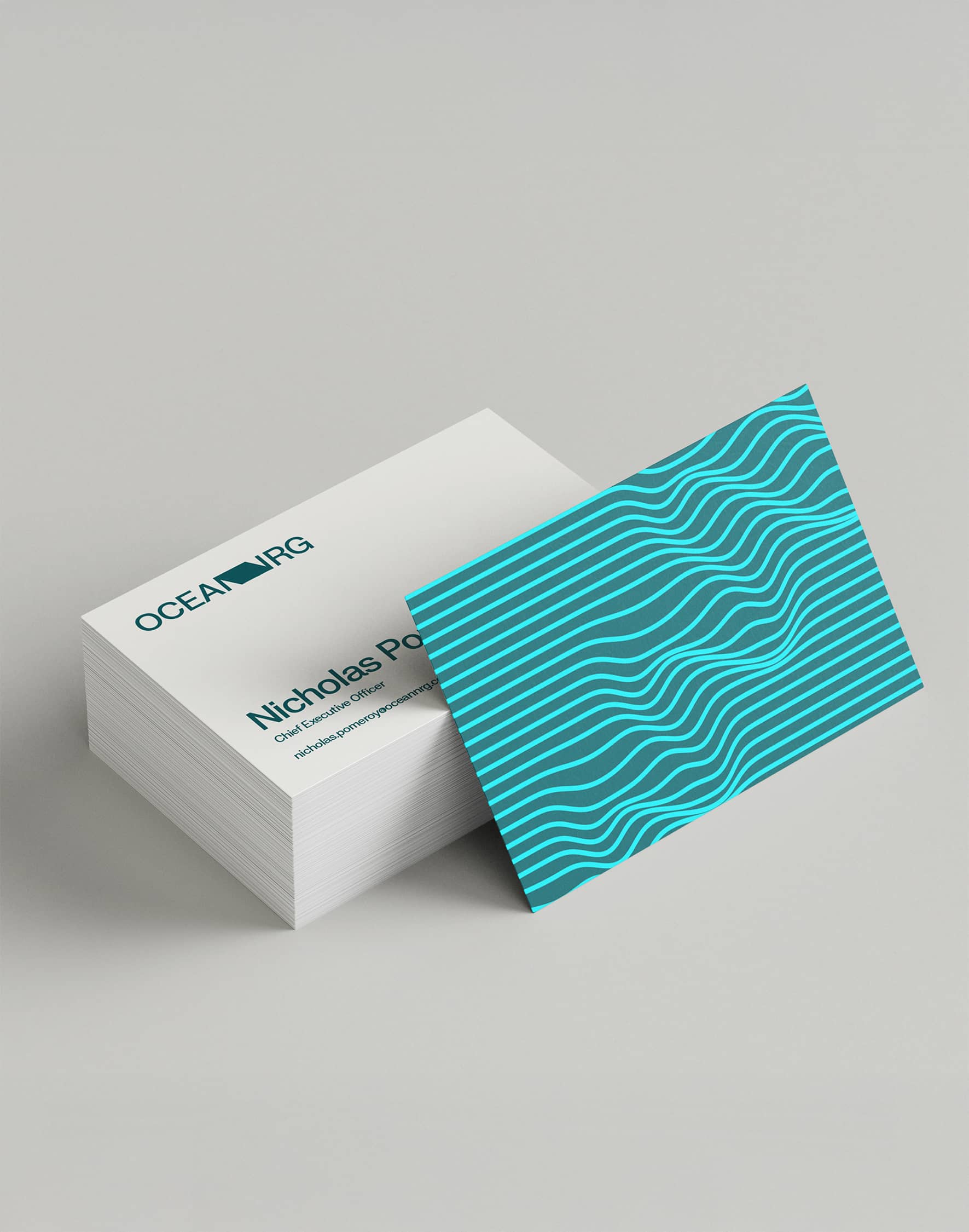
The bold, fresh design brings together the raw power of the ocean and blends it seamlessly with the green energy of the future. A sea change that is illustrated in the literal connection of two words to striking effect. Connecting the Ocean to NRG is more than a literal join however. It is indicative of a continuation of the centuries of sea power, from billowing sails to promising alternatives to fossil fuels. The industry is changing, and the symbolism of the graphics and colours honours this change. The diamond shape formed by the merging of the two words is more than just a design—it’s a window into the future of energy. It symbolises the journey of the wave in the ocean, representing sustainability and the boundless potential of ocean energy at the heart of Ocean NRG.