Desperate to grab the attention of potential customers before something else catches their eye, we’ve watched brand messaging distil into a crowded arena of meaningless word combinations shouted randomly at passers-by. Nuance, to put it mildly, has been given a kicking.
There’s nothing wrong with a canny turn of phrase, or a complex notion succinctly summarised into a poetic expression. But here’s the thing: those two words they’re so proud of sound just like all the others. They convey little, inspire only mild indifference, and connect to no-one. You only got time for two words? I got a couple for you, mate.
“Hulk SMASH”
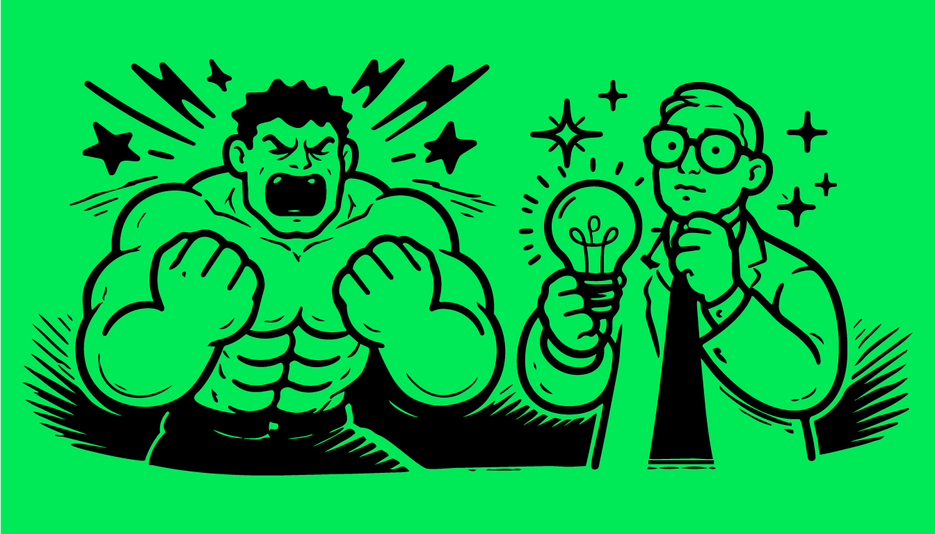
Bruce Banner’s viridescent alter-ego is a simple being. And if you were walking along the street and saw him loom over you looking angry – you’d notice. He’d yell, “Hulk SMASH!” at you, but you’re already running away. You wouldn’t need to be told twice.
Upending this article in the direction of Oh Yeah, your shiny new logo is The Hulk. Clear, undeniable, powerful, connects right away. Your messaging is Bruce Banner. Considered, concise, grown to work in harmony with its visual/mutated other half. One works in tandem with the other. Without Banner, The Hulk is terrifying. With him, it makes some kind of sense, and each imbue the other with a balance.
We aim to bring that balance to your brand, with Hulk Smash visual impact and Bruce Banner substance to your messaging. It will work in perfect harmony, and no-one will run screaming.
Tune in next week, when we attempt to explain the impact of complex minimalism in Twenty-First century design language through the medium of The Muppets. Can’t wait.