

Wasabi is a proof of concept project — a chance to explore what a brand refresh might look like for one of the UK’s most recognisable quick-service restaurants. The starting point was the founder’s story: a genuine love for both sushi and bento that led to a market stall in Camden, and eventually a chain. That dual passion felt like the most honest thing to build a brand around.
Takeaway food has surged in recent years, driven by the rise of delivery platforms like Just Eat, Uber Eats, and Deliveroo. Sushi and bento sit naturally in that space — fresh, fast, and increasingly mainstream. There’s a whole generation of people who haven’t yet discovered their love for either, and that felt like an opportunity worth designing for.
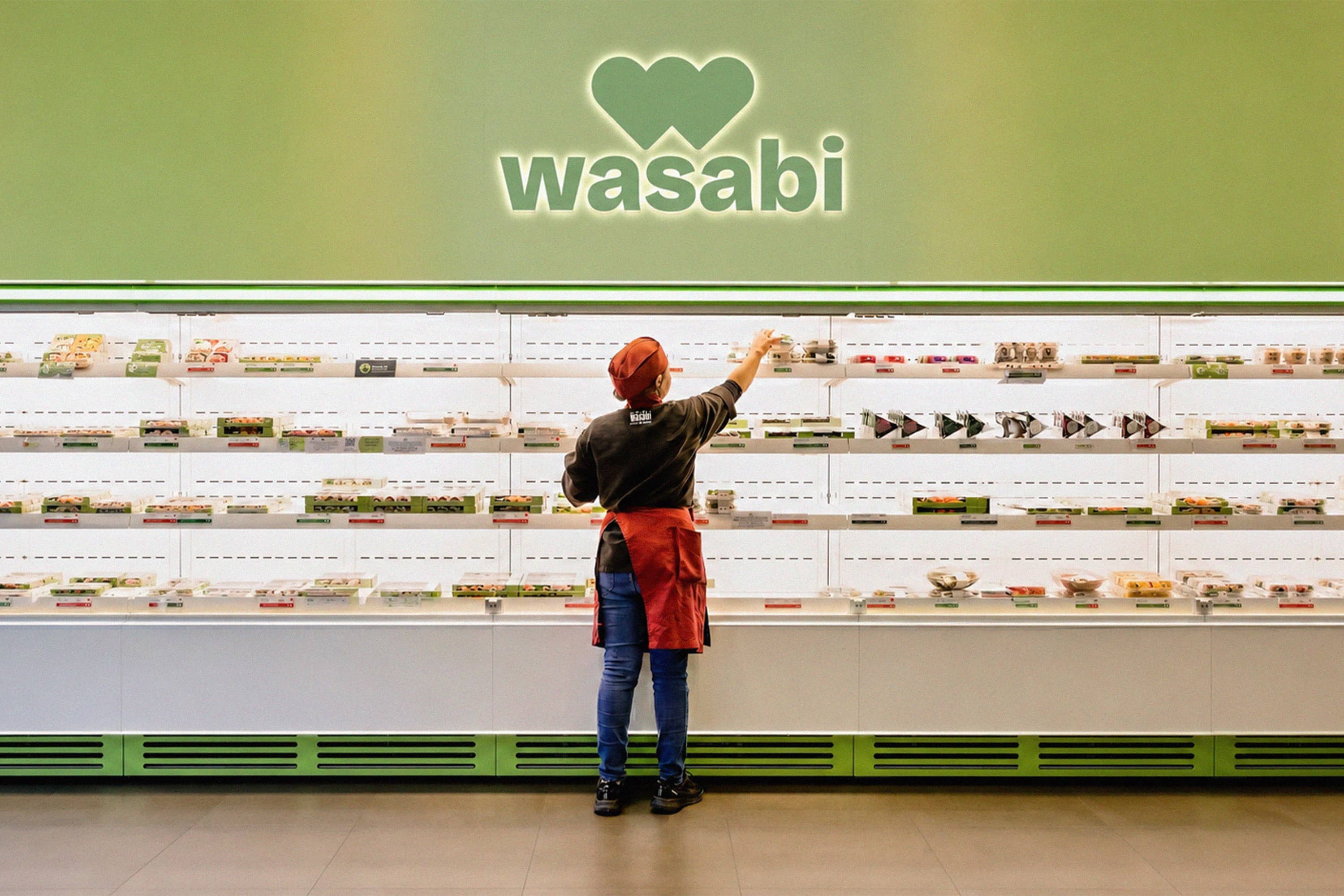
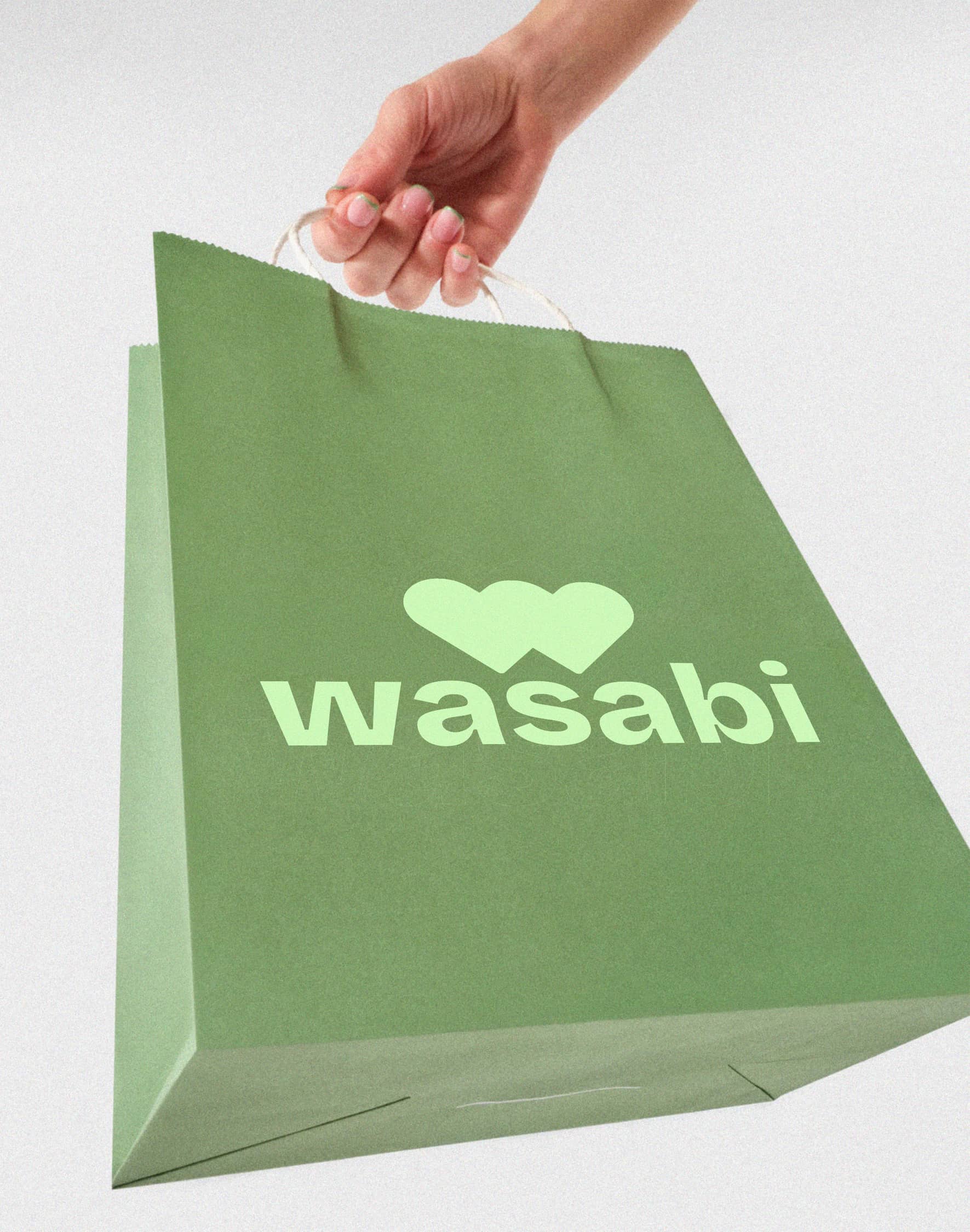
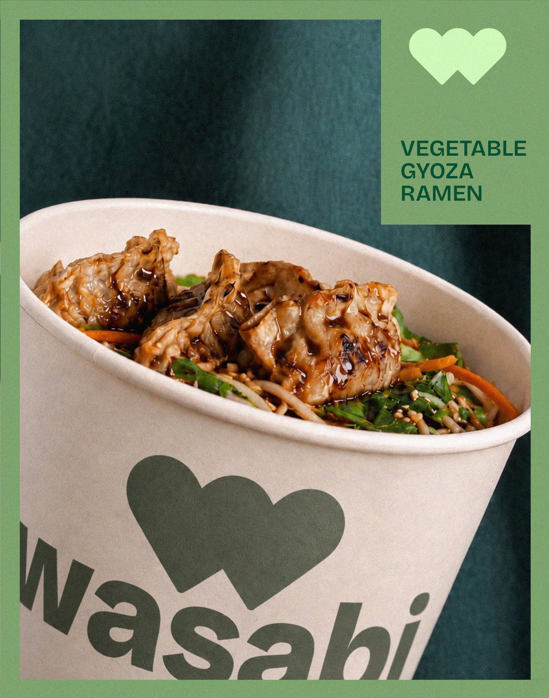
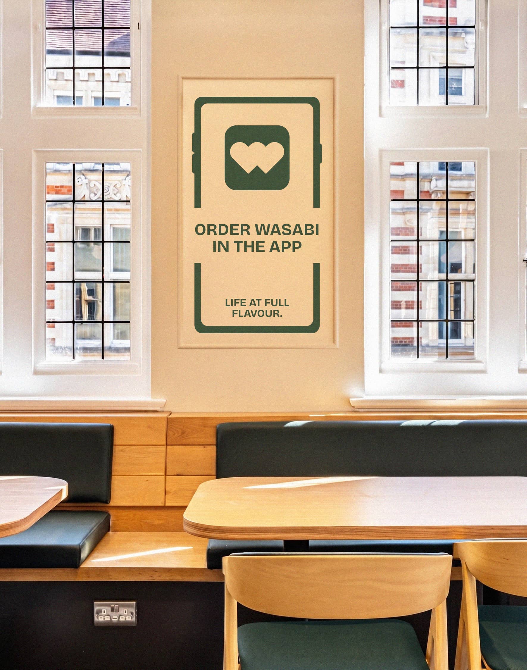
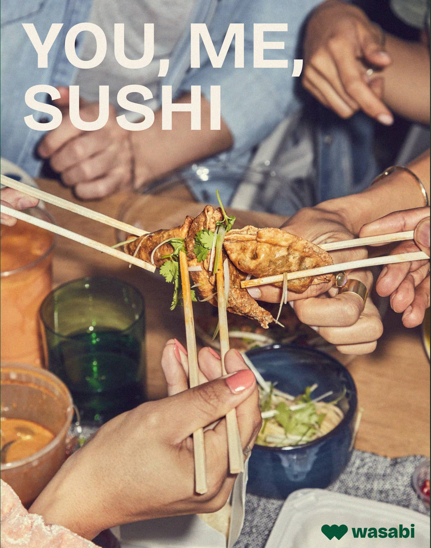
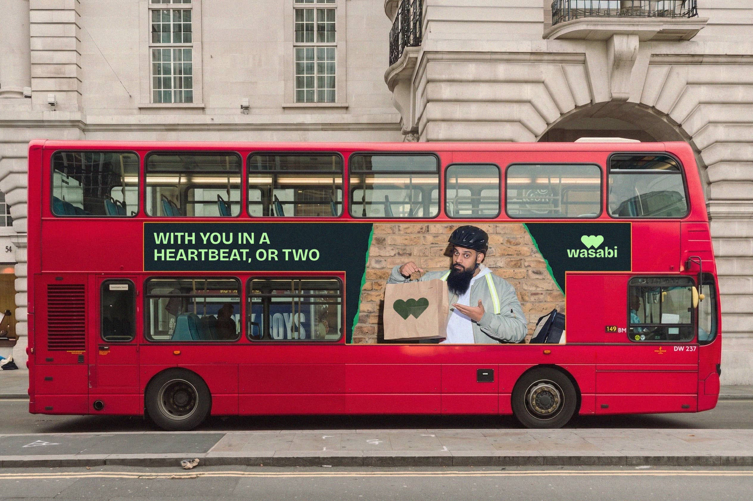
After researching the brand, a few things stood out: inconsistent language, two logos with no clear hierarchy, a disconnect between the shops and the website, and a social presence that didn’t do the food justice. The refresh needed a single, unifying idea – and the founder’s original passion gave us exactly that. Two loves. Two hearts. One for sushi, one for bento. Together they form the “W” at the centre of the new logo: a mark that isn’t just a letterform, it’s the reason Wasabi exists. The wider identity builds from there, with modern photography and a vibrant palette that takes the brand back to its roots — a market stall in Camden, and the street food spirit that started it all.